C Spacing Utilities
Utility classes for the spacing in your pages. (without the !important attribute)
How to Read the Class
Example: c-mt-sm-3.
Meaning: {prefix}-{type}{direction}-{breakpoint}-{value}.
SCSS: @include media-breakpoint-up(sm) { margin-top: 1rem; }.
CSS: @media(min-width: 576px) { margin-top: 1rem; }. (576px can change depending on the site’s configuration)
How to Understand the Class
c is the prefix and it stands for Clay. All the new classes have this prefix to avoid conflicts with other frameworks.
m is the type of spacing you need. In this case it stands for margin but you probably will find p for padding. (example: c-pt-sm-3 means @media(min-width: 576px) { padding-top: 1rem; })
t is the direction in this case it stands for top but you probably will find:
-
r- right -
b- bottom -
l- left -
y- top and bottom (vertical axis) -
x- right and left (horizontal axis) -
empty- when this value is not present it means you are applying this spacing to all the directions (example:c-m-sm-3means@media(min-width: 576px) { margin: 1rem; })
sm is the breakpoint where this rule starts to work, in this case started from sm, but we can also have: (see Grid Documentation)
-
sm- started from sm - started from 576px -
md- started from md - started from 768px -
lg- started from lg - started from 992px -
xl- started from xl - started from 1200px
3 is the value of the spacing you want to assign in the example. By default the spaces are:
-
0- 0rem - 0px -
1- 0.25rem - 4px -
2- 0.5rem - 8px -
3- 1rem - 16px -
4- 1.5rem - 24px -
5- 3rem - 48px -
6- 4.5rem - 72px -
7- 6rem - 96px -
8- 7.5rem - 120px -
auto- will set the value to auto
These spaces can be negative if we use n before the value, that means:
-
n1| -0.25rem | -4px -
n2| -0.5rem | -8px -
n3| -1rem | -16px -
n4| -1.5rem | -24px -
n5| -3rem | -48px -
n6| -4.5rem | -72px -
n7| -6rem | -96px -
n8| -7.5rem | -120px
How to Use the Class
The best usage of these classes take place in a responsive scenario:
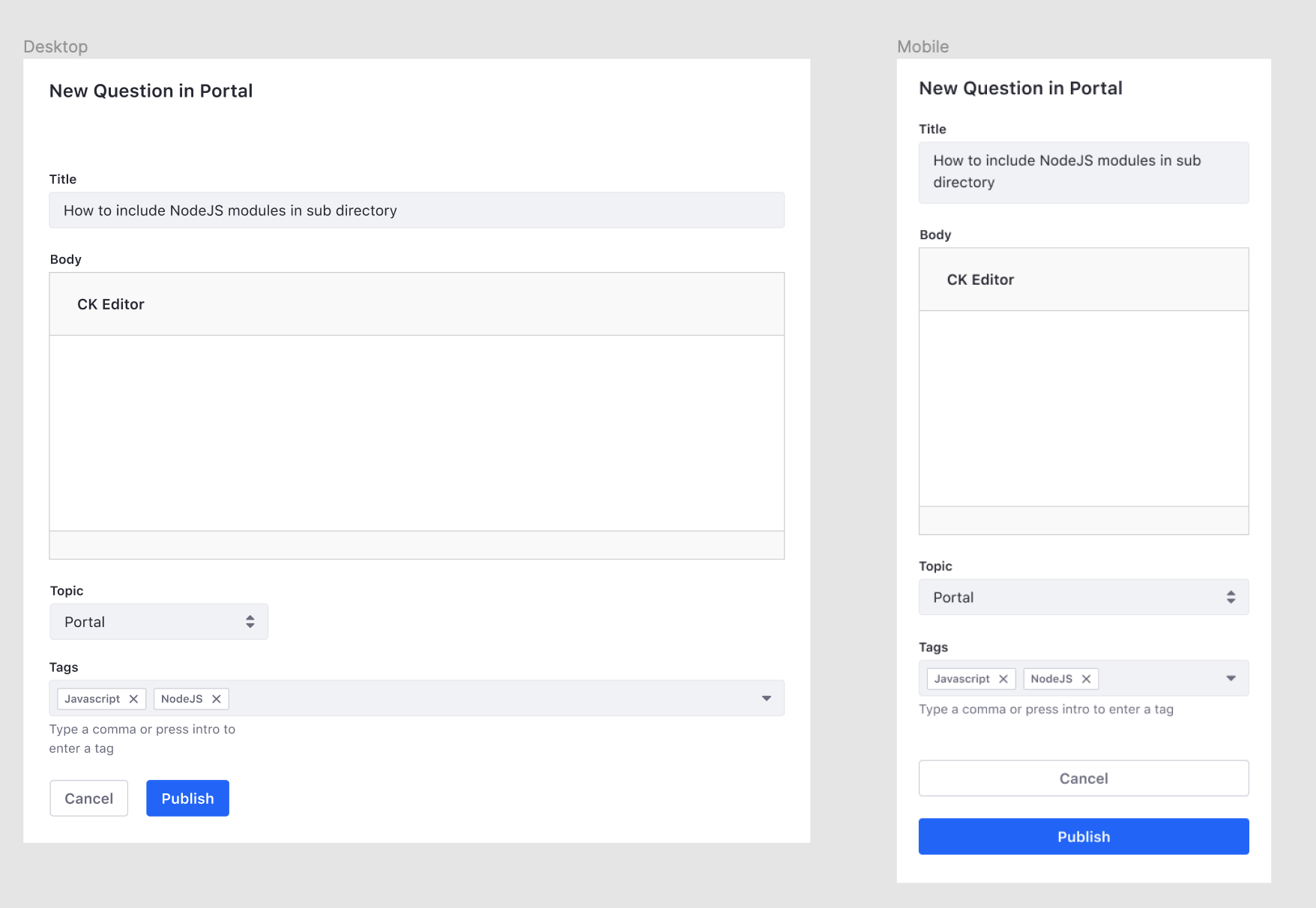
Let’s focus on the buttons Publish and Cancel.
We are leaving the style of these buttons to the classes btn-one and btn-two and taking care of the spacing using c-mt-3 c-mt-sm-0 c-ml-sm-3.
<div>
    <button className="btn-one">Cancel<button>
    <button className="btn-two c-mt-3 c-mt-sm-0 c-ml-sm-3">Publish<button>
</div>
If we translated these classes into CSS, this would be the result:
.btn-two {
	margin-top: 1rem;

	@media (min-width: 576px) {
		margin-top: 0;
		margin-left: 1rem;
	}
}
Gap
The gap CSS property sets the gutters between rows and columns of a flex or grid element. We use the same naming convention as margin and padding. The gap utility sizes are based on the $spacers scale, but can be customized to a different scale through the $c-gap Sass map.
The classes c-gap-{breakpoint}-{#} sets the gap CSS property which is shorthand for row-gap and column-gap. The classes c-gapx-{breakpoint}-{#} sets the column-gap CSS property; the left and right spaces between elements. The classes c-gapy-{breakpoint}-{#} sets the row-gap CSS property; the top and bottom spaces between elements.